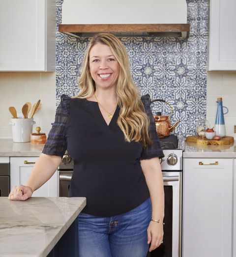
As the founder of the interior design firm, Sharp + Grey Interiors, Libby Rawes knew exactly how to refresh her family home in Philadelphia. Although some years passed since she, her husband and two kids moved from their smaller space in Denver, Colorado, Libby finally revamped her 1920s Foursquare house with more modern, comfortable and livable features. “The house is the perfect blend of feeling like you have separate spaces, but also open enough where things can flow,” she says.
Libby designed the open floor plan with a play of cool and warm tones that maximize natural light and experimented with an assortment of textures for an inviting vibe.
Living Room
Decorate with inspiring paintings.
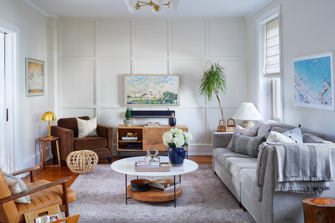
“I’m one of those people where if I find something I like, I’m drawn to it and just add it,” Libby says. This applied when designing her living room with artwork. The photograph on the left is from an artist in Colorado, while the painting on the right is an overhead view of Italy’s coast. “I grew up in Denver, so I think of Colorado as wide, open spaces, plains and prairies,” Libby says. “That picture [on the left] always brings me back to home.”
Design Tip: When choosing the perfect painting, Libby suggests picking one that’s meaningful to you. “You don’t necessarily have to match your artwork to your space,” Libby says. “Something that feels at home within the space will give you that calming effect.”
Don’t be afraid to layer materials.
Neutral colors and varied textures are hallmarks of Libby’s design style. The living room sofa features a velvety fabric; parts of the space boast cool leather accents; the rug has a subtle variation of texture; and the white table is crafted of wood and metal. “It’s all about mixing lots of different elements,” Libby says. “Texture can create a space that feels neutral without being flat.”
DIY an accent wall.
Libby’s husband, who is an electrician, helped transform their plain living room wall into an eye-catching focal point. They added box molding for texture and painted it with an eggshell sheen. “It has a little more light popping off of it and added what the room was lacking,” Libby says.
Design Tip: “Anywhere you can, bring in some life,” Libby says. Greenery can add height, color and texture.
Dining Room
Design a modern and welcoming eating area.
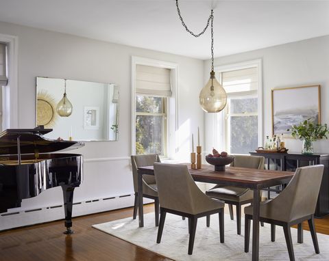
“This room was interesting, because the piano makes it a touch off-center,” Libby says. Although she doesn’t play, it was her mother’s and makes a beautiful addition to the dining room. “I wanted this to feel cozy when you’re having a nice dinner but also really clean because the house is open enough that you want the spaces to all flow,” she says.
Add a statement light fixture.
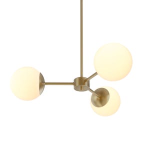
Libby chose her curvy glass pendant due to its subtle look. It complements the room’s homey feel and makes a gorgeous focal point upon walking in. “The light has this compact design and it’s pretty at night,” she says.
Get the look: Devon Basket, anthropologie.com; Flynn Recycled Glass Pendant, potterybarn.com; Arden Upholstered Dining Armchair, worldmarket.com; Ebers Cream Cowhide Area Rug, allmodern.com
Bedroom
Embrace older architecture.
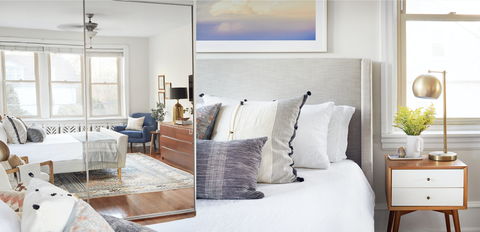
When Libby and her family moved into their home, it was a traditional house with a Victorian feel — full of heavy colors and antiques. Instead of changing the classic look altogether, Libby decided to incorporate modern elements into her bedroom’s design scheme. She paired her bed, which is a twist on the traditional sleigh style, with mid-century modern nightstands and a rug that has blue and blush tones. And since the radiator is an original detail, instead of taking it down, she used the rug as a complement to its intricate pattern.
Design Tip: Windows and mirrors can make your space seem larger while helping to bounce light around the room. Libby added mirrored sliding doors to her closet to brighten up the space.
Carve out a corner nook.
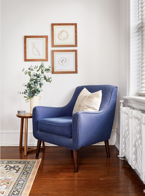
The blue chair in Libby’s bedroom corner is her way of weaving color into the space. A small table and vase of greenery create a calming aesthetic. “I always loved these frames because of their peachy-brown color,” Libby says. “I took the artwork out and replaced them with paintings from an artist on Etsy to create this little vignette.”
Laundry Room
Go for contrast.
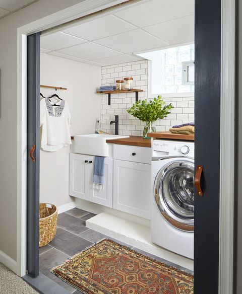
“This was a horrible, dingy and disgusting closet of a laundry room,” Libby says. This inspired her to completely revamp the area with a light and fresh feel. She added contrast to the white space with dark, large-scale floor tile and touches of wood for warmth. Similar to other parts of her home, Libby included a small vintage rug for color. Because she loves how leather looks against dark hues, she painted the sliding doors a dark gray and installed leather handles for a unique look.
Design Tip: Dark tile floors can make a small room appear bigger.
Get the look: Rust Timeworn Charm Area Rug, rugsusa.com; Josie Woven Baskets, ballarddesigns.com
Office
Add a warm and rustic feel.
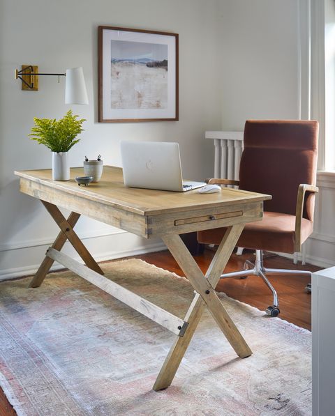
Libby’s office is the smallest room in the house. She loves how her white space contrasts with the various wood textures. “I wanted to make it feel warm and serene,” Libby says. “I started the room with this rustic chair and brought in this vintage rug, which adds character and depth.”
Design Tip: Keep chords hidden to make your space feel clutter-free.
Get the look: Flynn Single Wall Sconce, serenaandlily.com; Yaretzi Conference Chair, wayfair.com; Monarch Modern Criss Cross Writing Desk, homesquare.com
This content is created and maintained by a third party, and imported onto this page to help users provide their email addresses. You may be able to find more information about this and similar content at piano.io

